#team lead
#ui design
#ux research
#product analytics
#figma
Background
I led the end-to-end design for a GPS-based fleet management software integrated with a leading cloud-based field service management system.
The outdated UI and poor navigation frustrated users, and the software lacked meaningful integration with our primary enterprise application.
User Research
UI Design
Project Lead
3 Months
Fleet Tracking
Discovery
I conducted a survey of our userbase with some quantitative, qualitative and open-ended questions on the state of the product.
The results of this survey pointed toward a clear need for stronger cross-platform integration, more detailed reporting, and more intuitive navigation. These aligned with business goals and were set as focuses for the project.
I also had access to an funnel based analytics tool embedded into our software. From reviewing usage data I was able to identify a standout insight.
41% of our users don't use more than one page.
After login they generally don't navigate away from the map screen, meaning most of our functionality flies under the radar.
This became a key part of my design approach.
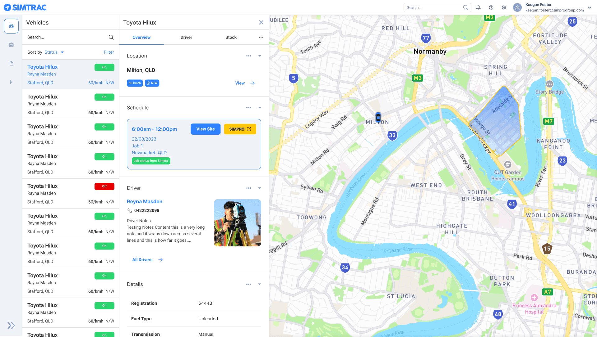
I wanted to enable a user to be able to use as much functionality as possible, while keeping them within the initial map screen.
UI Design
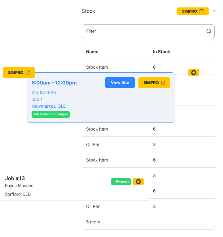
A "stacked cards" IA approach worked best for our user's needs.
It allowed the most important information to always be available without navigating to another screen.
Importantly - it allowed the main focus of Simtrac - the map - to be always on display to the right of the cards.

Visual Language
To highlight integration points with the enterprise product, I developed a cohesive visual language using one of the primary brand colors. This created a seamless user experience and clearly indicated interactions with the external system.